



Text by Eric Stinton
Images courtesy of Kenji Fujita and the Barnes Foundation
Graphic designers are traditionally dreamers,” Sadamitsu Neil Fujita wrote in his vocational guide, Aim for a Job in Graphic Design/Art. “Other people have fantasies—dreams of an unreal world in which they escape reality. The designer’s dream world, on the other hand, is grounded in reality.” It was a practical statement on the negotiation between artistic vision and client demands, something the Waimea-born graphic designer was all too familiar with. Upon the book’s publication in 1968, Fujita was already two decades into a career that took him from the rural canyons of Kaua‘i to the towering skyscrapers of New York City. The insight was also hard-won, gleaned from a lifetime spent piercing the professional and personal boundaries the world had drawn around him.
Born on Kaua‘i in 1921 to Japanese immigrant parents, in a rural part of a rural island in Territorial Hawai‘i, Fujita’s tropical hometown offered few options beyond the hard labor of the sugarcane fields. His mother recognized this and transferred her son to Mid-Pacific Institute his junior year of high school. “That was a ticket out of plantation life,” says Fujita’s son, Kenji. While at the Honolulu boarding school, Fujita discovered an aptitude for art that would carry him to Los Angeles upon graduation, where he later enrolled in the esteemed Chouinard Art Institute in 1939.
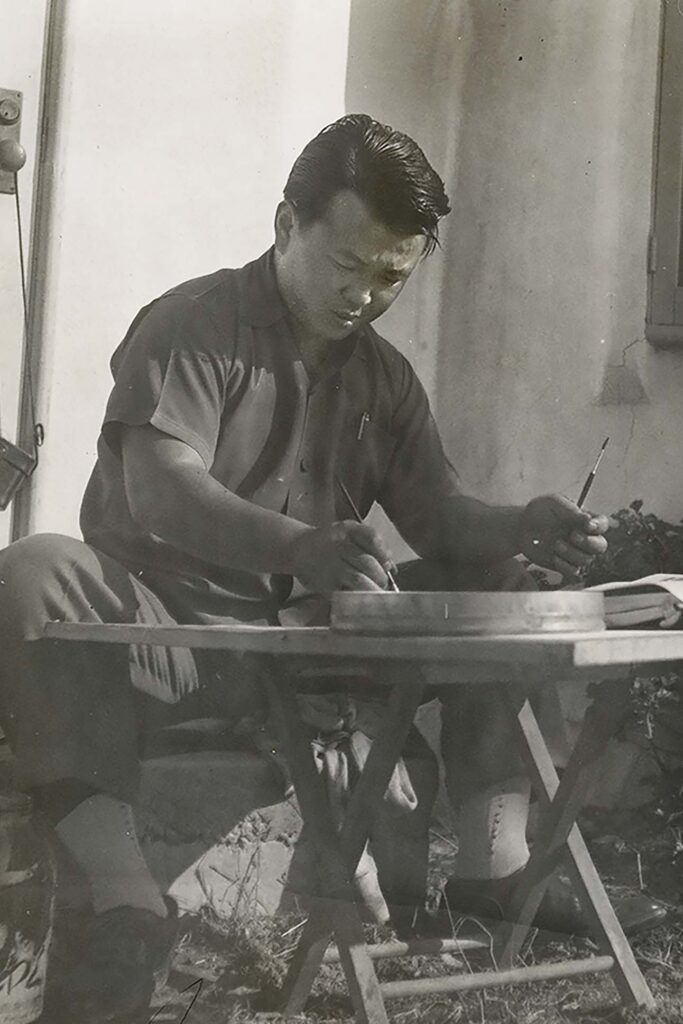
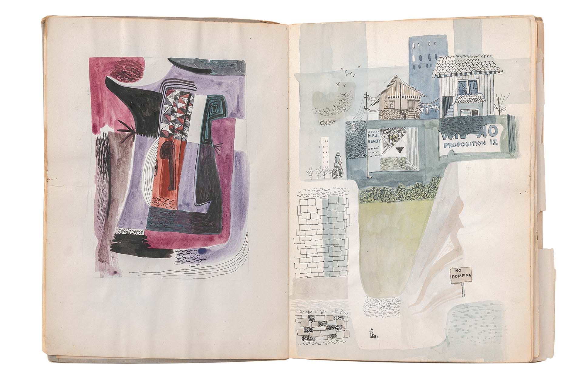
But war clouds were billowing across the Pacific, sharpening anti-Asian sentiments latent in California. After Japan attacked Pearl Harbor, Fujita’s Japanese descent classified him as an enemy alien. He was forcibly incarcerated at Wyoming’s Heart Mountain Relocation Center Camp in the fall of 1942, alongside 11,000 other Americans, then the third largest population in the state. While there, he became the art director for the camp’s weekly newspaper, the Heart Mountain Sentinel. For its three-year run, the masthead would bear Fujita’s original design: two simple flowing lines with a stipple of shading symbolizing Heart Mountain on the horizon.
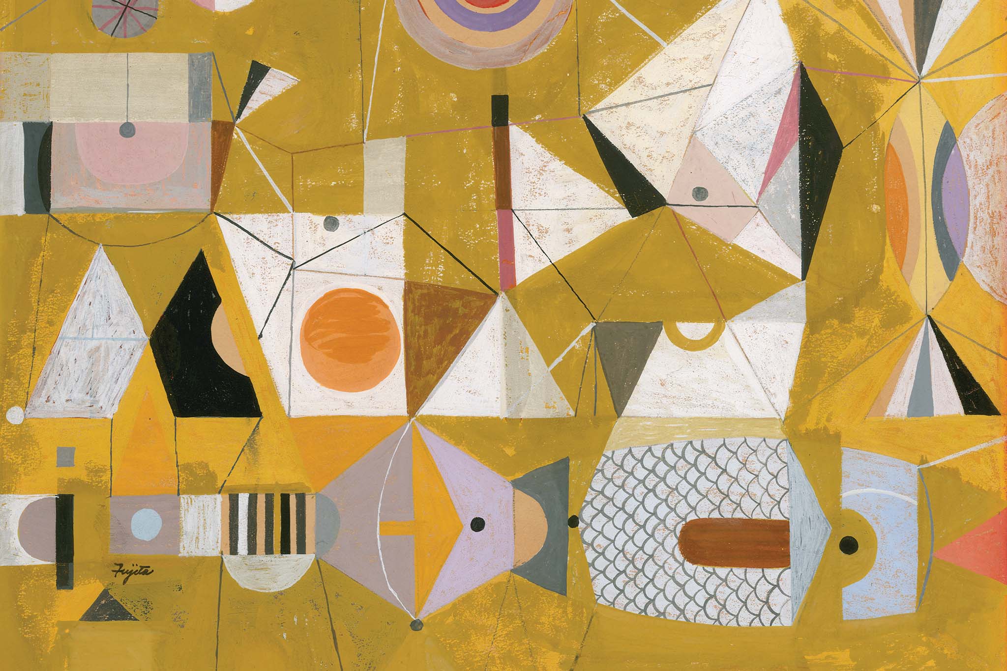
The following year, Fujita enlisted in the Army, perhaps hoping it would offer a way out of internment. Trooping through Europe in the 442nd Infantry Regiment, Fujita was likely more focused on survival than maintaining a creative practice. Still, art never fully left his mind. Re-enlisting as a translator, his second tour brought him to Okinawa, where he was introduced to traditional Japanese art, a facet of his heritage he had never encountered, even as his parents were from Japan. It would brush off onto his style, an aesthetic that graphic designer Milton Glaser would later describe as “a kind of synthesis of Bauhaus principles and Japanese sensibility.”
Fujita returned to Chouinard after the war. Though his focus was drawing and painting, pragmatism moved him to take graphic design classes in his final year. “I knew I had to make a living, and that painting wasn’t going to do it,” he said in a 2006 interview. He landed a job at the prominent advertising agency, N.W. Ayer & Son, moving with his wife to Philadelphia. Then, CBS art director William Golden came calling with a fateful proposition. The network’s label, Columbia Records, had begun to lose its edge to leaner upstarts. Once the vanguard, propelled in large part by Columbia’s early adoption of graphic album covers, their competition had now caught up. Golden needed an infusion of new talent. In Fujita, he found a visual force.
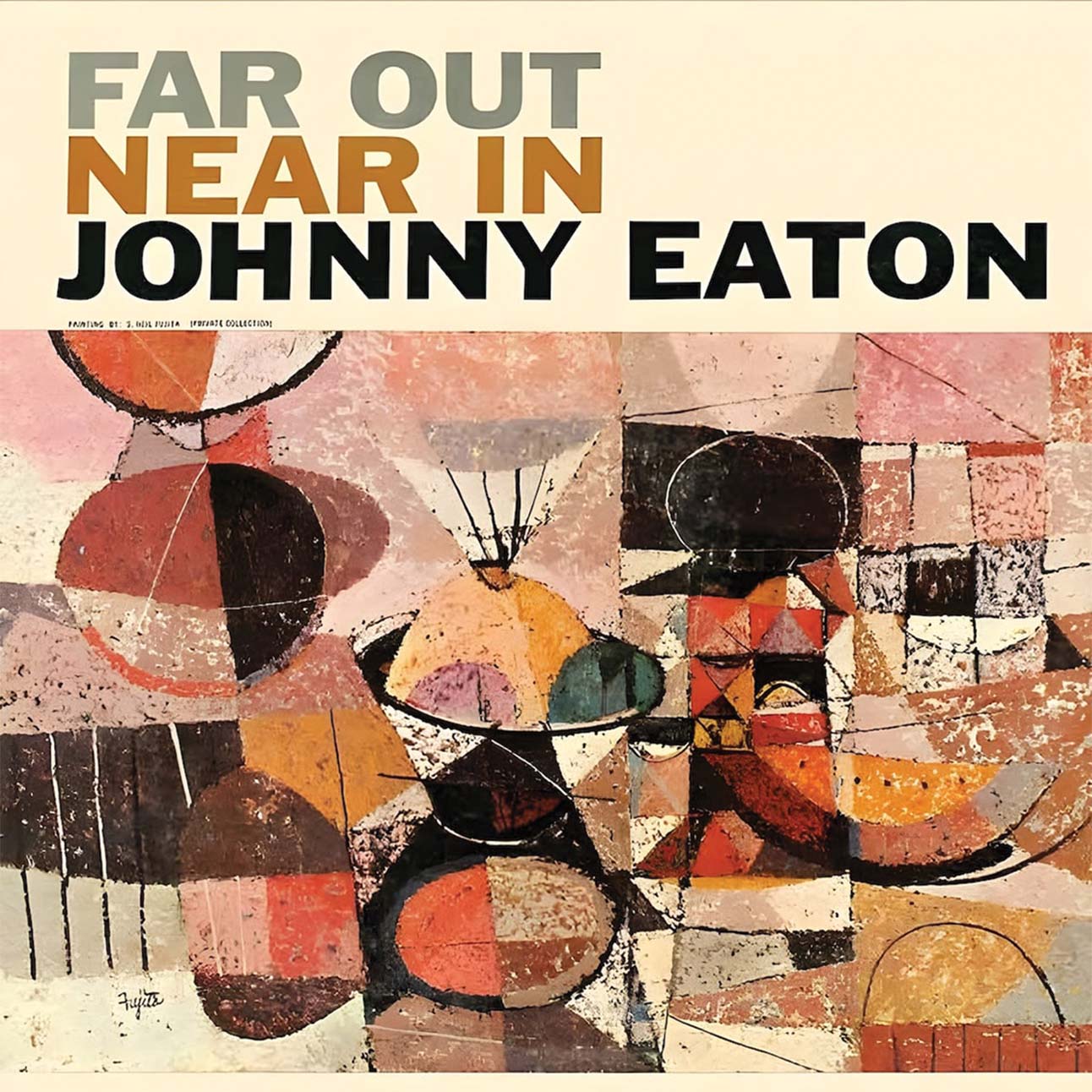
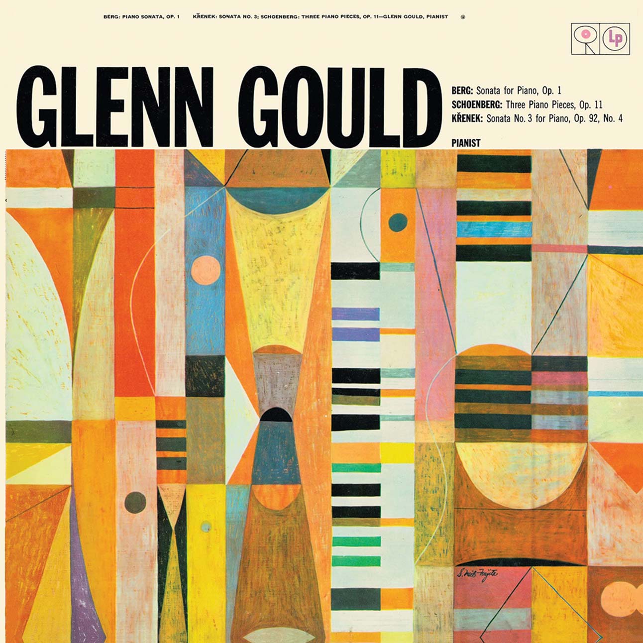
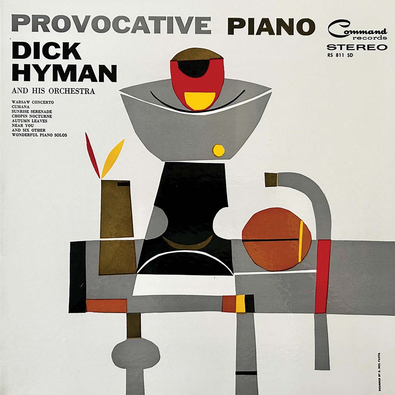
Yet, when Fujita started as Columbia’s art director in 1954, it was not the work, but the simmering racism that proved most challenging. Colleagues warned him of the anti-Japanese attitudes that remained in the war’s aftermath. Undeterred, Fujita built a team that must have seemed radically diverse for 1950s America. “He hired women, he hired Puerto Ricans, he hired Black people. That was rare at that time,” says Kenji. “It gives you an idea of where he stood on matters of racial and gender equality.”
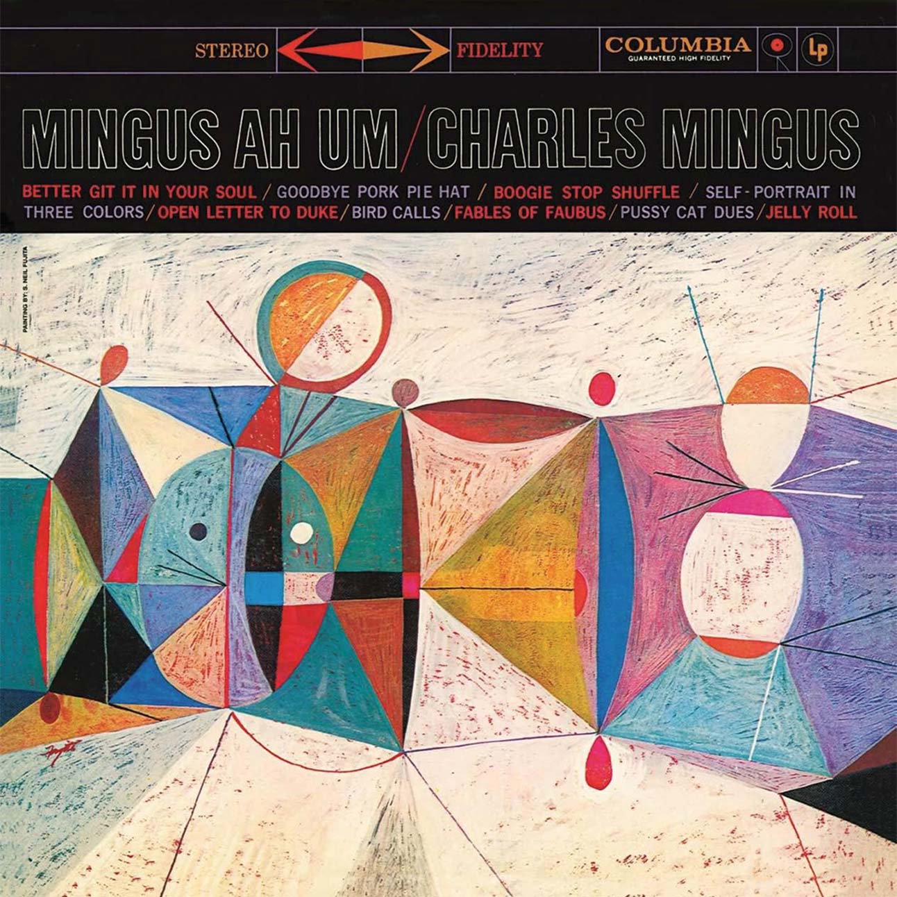
His work would speak for itself. At the time, Columbia held some of the biggest names in jazz including Miles Davis, Charles Mingus, and Dave Brubeck. The genre, free-flowing and improvisational by nature, called for more complexity than the straightforward photographs and minimalist designs that so far typified album covers. Fujita saw the possibility to do more. “Design is not merely a visual arrangement,” he writes. “It is an instrument through which a message is transmitted. Design can be as effective an instrument in communication as a piano to a concerto, or words are to poetry.”
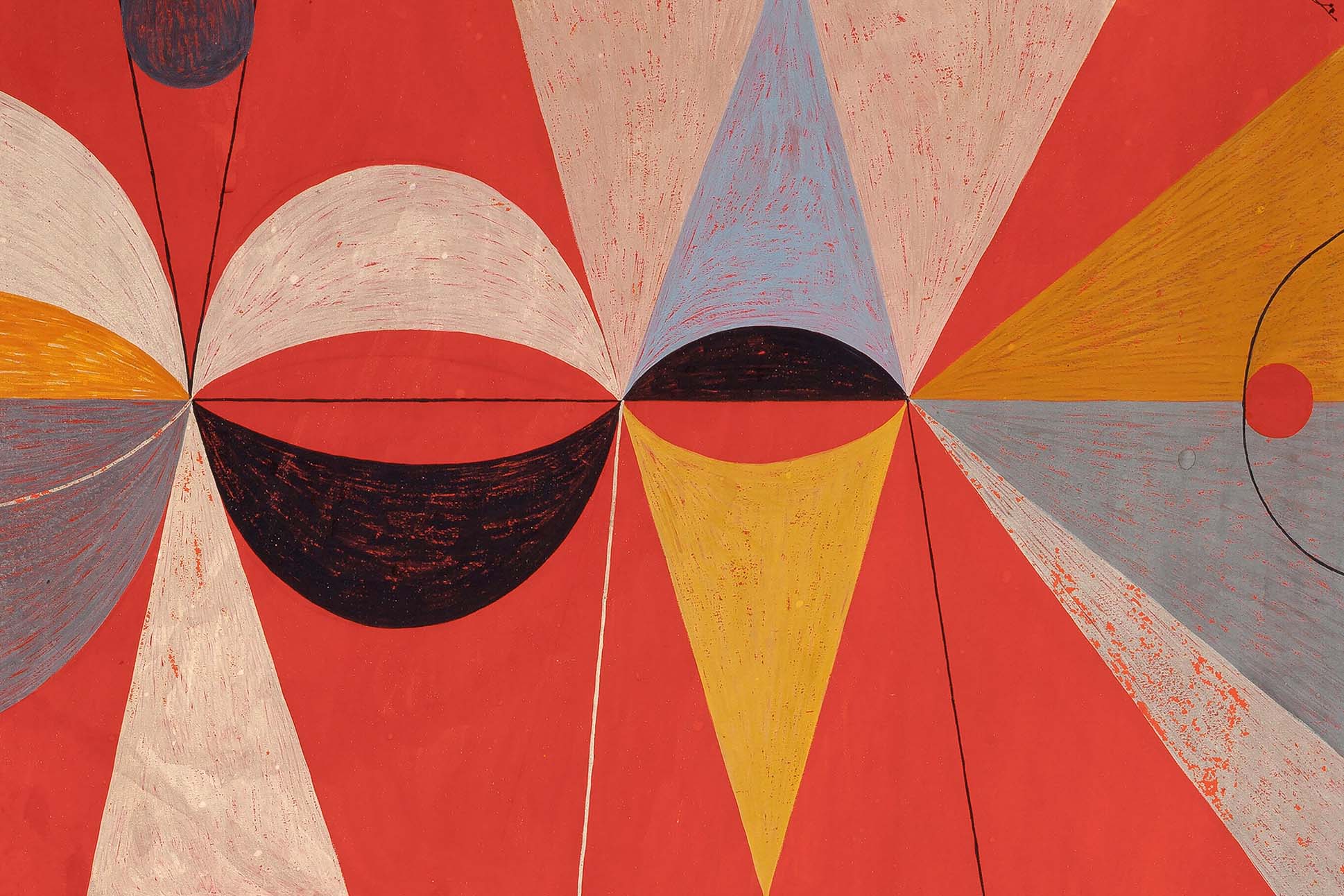
Fujita often turned to his own paintings for material, like with Brubeck’s landmark Time Out, the first jazz record to sell over a million copies. Frenetic and avant-garde, the cover is an abstraction of disc-like shapes—bulging in places, contracting in others—as if looking through a magnifying glass at marbles rolled out onto a picture frame. Broad, brushy streaks of purples and blues shade the edges, framing a golden halogen glow at its center.
It looks like how a jazz lounge feels, translating the genre’s melodic and rhythmic asymmetries into a whirl of brushstrokes. “He was really into the symbolic meaning of images and colors,” says Kenji. Today, Fujita’s cover art defines the record as much as Brubeck’s syncopations—a deliberate synthesis of the visual and sonic never before seen on an album cover—and set a new industry standard: treating the cover as an extension of the music.
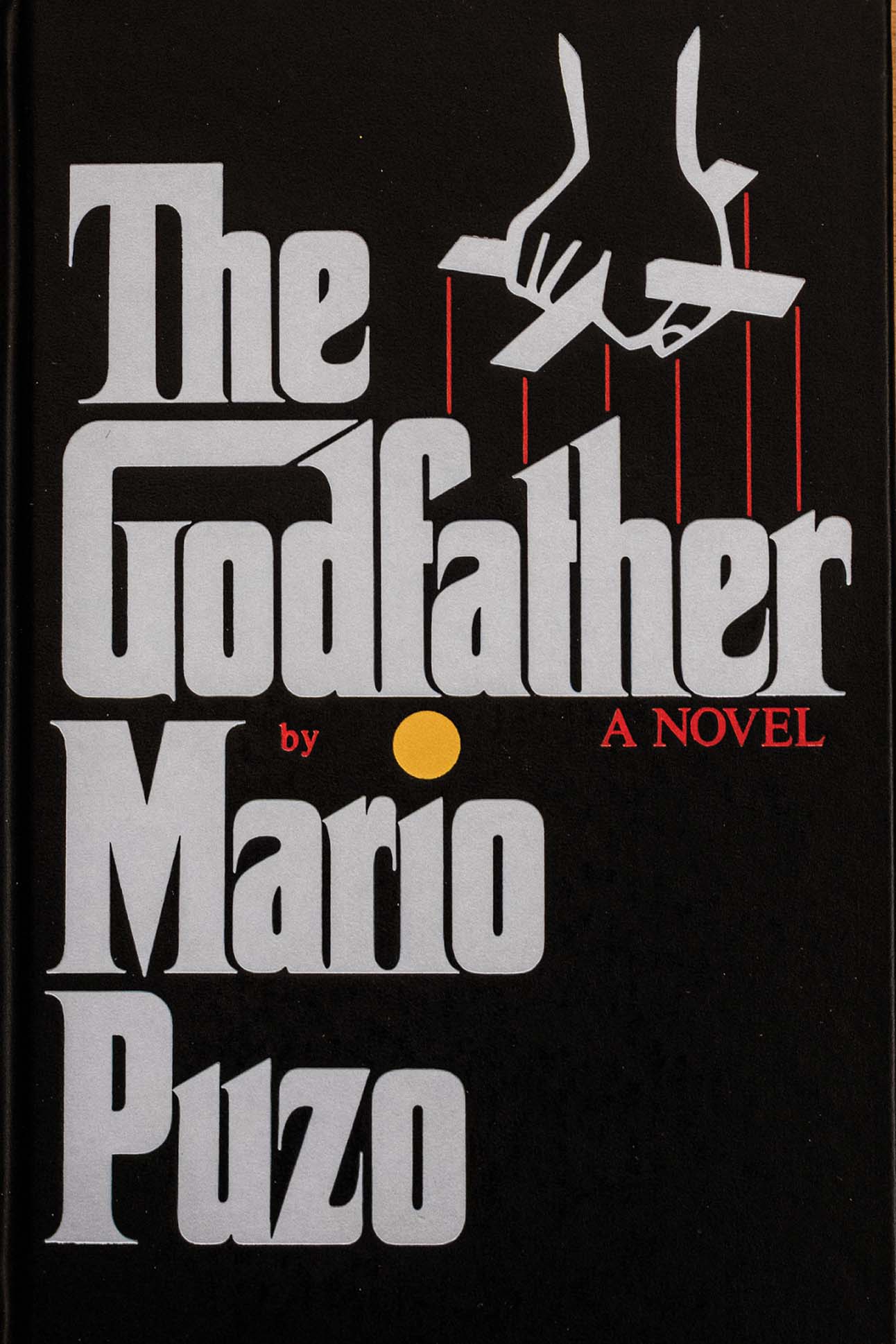
Other times, he called on famed artists for designs. For Columbia’s reissue of Chopin: Nocturnes, he tapped Andy Warhol to render the composer’s dreamlike piano melodies into blotted ink line drawings of flowers and fireflies. Later in his career, he expanded into book covers, most notably designing Truman Capote’s In Cold Blood and Mario Puzo’s The Godfather. The latter was so successful Francis Ford Coppola’s award-winning adaptation retained the typography.
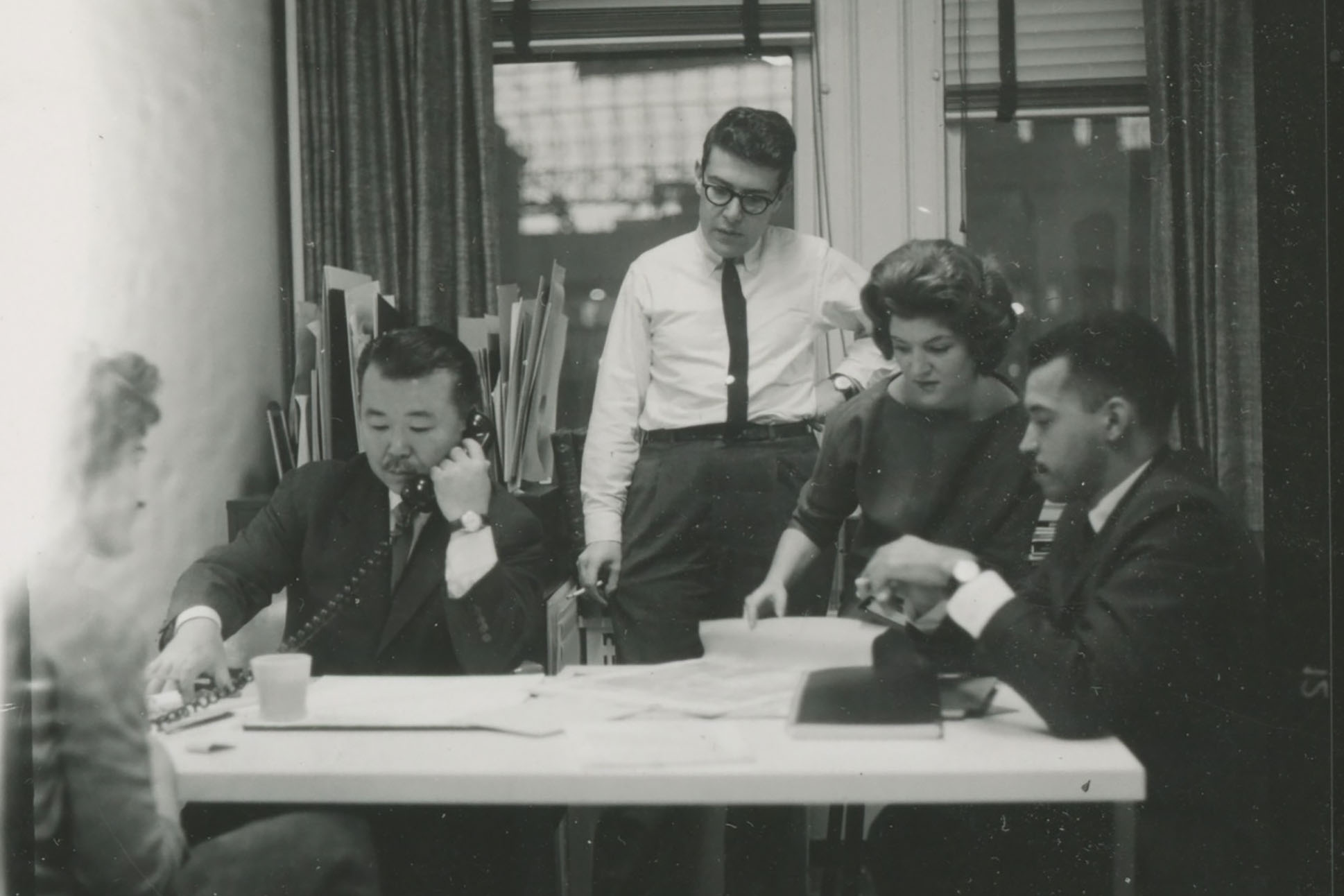
Eventually, Fujita made a home in New York. Still, he would find occasion to return to Hawai‘i, Kaua‘i’s ocher-stained expanse never seeming to leave him. “From this great, bustling, noisy metropolis,” he wrote in a 1959 column for the Honolulu Star-Bulletin, “my thoughts often go back with affection to the then village on Kauai that was my boyhood home.”
Rothko. Pollack. Liechtenstein. Warhol. Fujita. By the time of his death in 2010, Fujita had established himself among the great postwar visual artists with work as influential and recognizable as that of his peers, even if his name is not as widely known. “The really good artists are the ones you come back to, who you may have overlooked earlier in your life,” says Kenji. “My dad’s a little bit like that.”